Contrast and Complement: Using Color to Create Dynamic Interior Spaces Aug 25, 2025
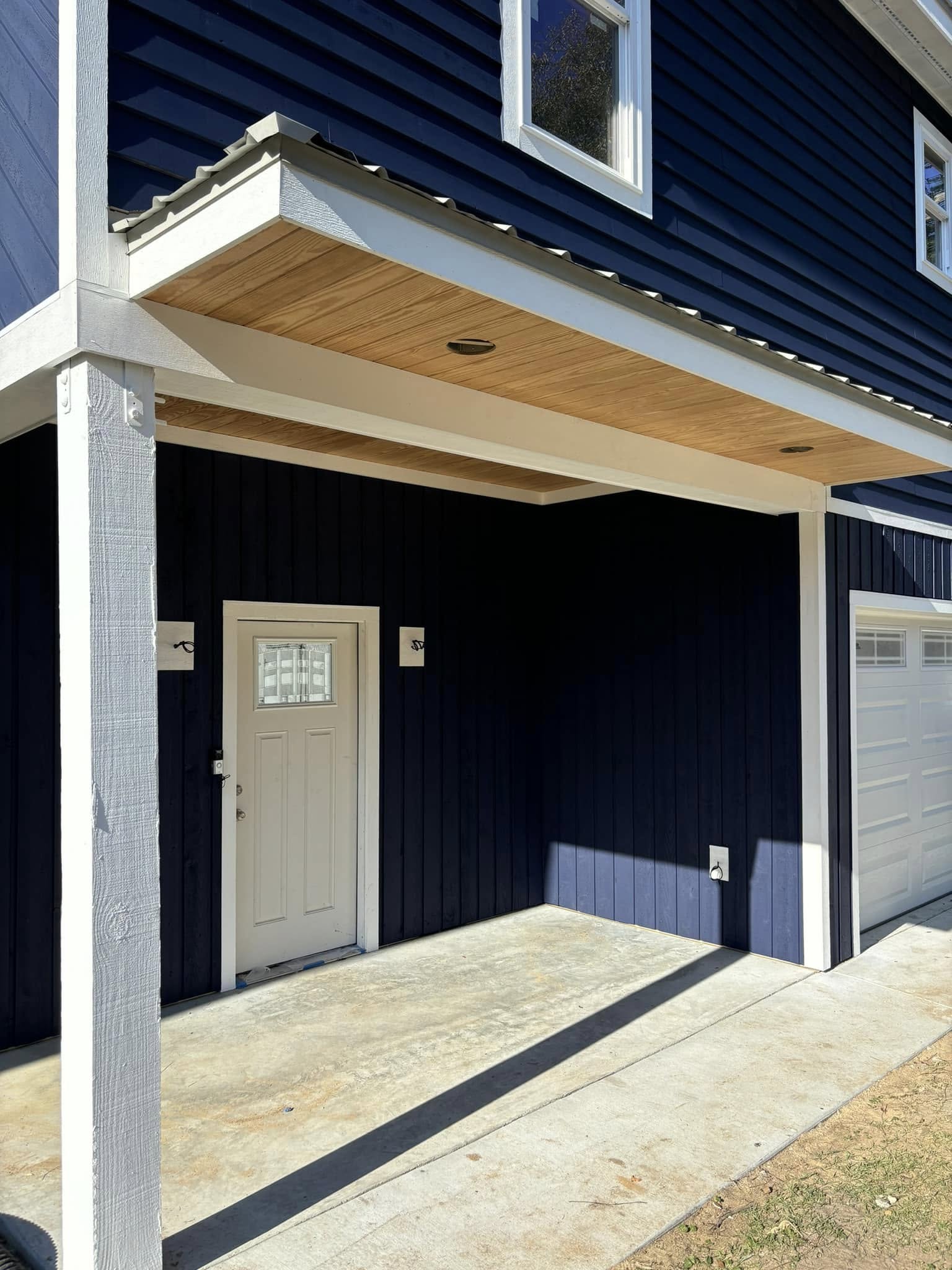
Begin your exploration with a fundamental principle of color theory: contrast. Contrast involves using colors that stand distinctly apart to create visual interest and add depth to a room. The classic example of contrast is pairing colors from opposite sides of the color wheel, such as blue and orange or red and green. These combinations can invigorate a space, making it lively and energetic. For instance, a crisp white wall paired with bold navy blue accents can produce a modern and sophisticated look, perfect for adding a touch of elegance or drama to any room.
However, effective use of contrast goes beyond just bold color juxtapositions. It also includes playing with light and dark shades within the same color family to create a subtle and sophisticated look. Imagine a living room where soft, pastel curtains offset a deep, rich sofa, allowing both elements to stand out yet harmonize beautifully. This less obvious approach to contrast ensures that a space feels cohesive while still offering visual surprise.
Complementary colors, on the other hand, focus on creating harmony and balance. These are colors that sit next to each other on the color wheel, offering a more nuanced and understated vibe. A room painted in soft cream complemented with accents in warm peach or light gold can evoke a sense of calm and tranquility. Complementary colors help bring unity and continuity to a space, making them excellent choices for rooms meant for relaxation, such as bedrooms or study areas.
When applying these concepts in your interior spaces, it's crucial to consider the room's purpose and existing decor. A high-contrast palette can powerfully energize a playroom or kitchen, fostering creativity and interaction. In contrast, soothing complementary hues can transform a bathroom or bedroom into a sanctuary of peace and restfulness. At Duffett Brothers Painting, we believe in customizing color strategies to suit the specific needs of each room, creating uniquely tailored and harmonious interior environments.
Incorporating patterns and textures also enhances the effects of contrast and complement. For instance, a textured wall or uniquely patterned wallpaper in a contrasting color can serve as a bold focal point, adding dimension and interest. Similarly, integrating different materials like wood, glass, or metal can complement the overall color scheme, bringing additional layers of richness and personality to the design.
Before embarking on your paint journey, always test colors in the actual space. Observe how they interact with the natural light at different times of the day, and how they blend with existing furniture and fixtures. A well-thought-out palette is the foundation of a remarkable room transformation.
In conclusion, the power of color is undeniable in the realm of interior design. Contrasting and complementary colors, when skillfully applied, can elevate any space from ordinary to extraordinary. At Duffett Brothers Painting, our expertise ensures that your visions come alive, providing dynamic and balanced environments that reflect your style and personality. Embrace the transformative magic of color, and let us guide you in crafting the spaces of your dreams.
/filters:no_upscale()/filters:format(webp)/media/eb6accf1-a9d5-448d-8f3d-25870db55bdd.jpeg)
/filters:no_upscale()/filters:format(webp)/media/45ff2389-0458-4f94-a40c-7f1ea8781484.jpeg)