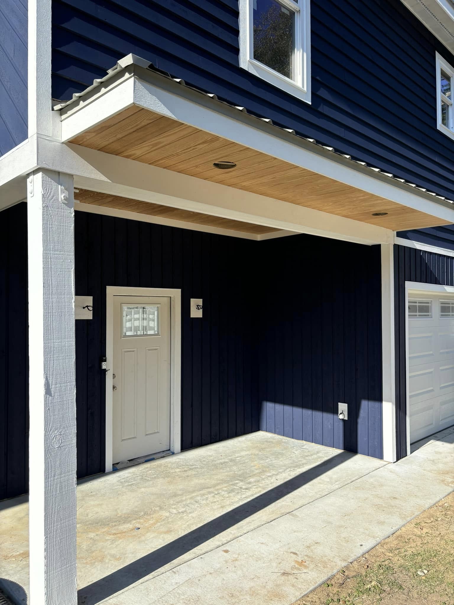
Striking the Balance: Harmonizing Bold Hues and Neutral Tones Jun 21, 2025
The first step in marrying bold colors with neutral tones is understanding the influence each has on a room’s ambiance. Neutral tones, such as whites, greys, and beiges, form the perfect canvas that allows bold hues to stand out without overwhelming the senses. These colors provide a calming backdrop, encouraging spatial tranquility and a sense of openness. On the other hand, bold colors like emerald green, deep navy, or vibrant coral inject energy and personality, becoming the focal points that draw attention and add character to your interiors.
To successfully integrate these contrasting elements, consider the 60-30-10 rule—a timeless guideline in interior design. Typically, 60% of a space should utilize a dominant color—often a neutral tone to create a cohesive foundation. The secondary color, occupying about 30% of the room, can be a bold hue, offering ample visual interest. The remaining 10% consists of an accent color, which could either complement or contrast the dominant and secondary hues, adding that final touch of intrigue. This method ensures that bold colors do not overpower but rather harmonize within their settings.
A masterful way to guide this blend is through thoughtful color pairings. For instance, pairing soft greys with a bold turquoise can invoke a modern and refreshing feel, while ivory paired with a sleek slate blue strikes a sophisticated elegance. It is important to consider the natural light in the rooms. Spaces with ample sunlight might benefit from darker bold hues that accentuate the light, whereas shadowed areas can come alive with lighter tones complemented by punchy color accents.
Textures and materials play a crucial role as well. Incorporating different materials such as wood, metal, or stone can introduce variations in tone that interact beautifully with both bold and neutral schemes. Consider a plush grey sofa accented with vibrant throw cushions, or a wooden floor offset by a compelling area rug with colorful patterns to add depth without clashing.
Ultimately, the key to achieving a harmonious balance lies in personal expression. Duffett Brothers Painting understands that every client's home is unique, deserving a personalized color palette that reflects their personality and lifestyle. Our professional consultations provide insight into how color can transform a space according to your vision and functional needs.
Concluding, balancing bold and neutral shades can significantly elevate your home’s aesthetic appeal, creating a dynamic yet serene environment. By carefully considering color combinations, proportions, and the interplay of light and material, Duffett Brothers Painting can help you strike the right harmony in your spaces. Whether you aim for a bold statement or a subtle infusion of color, harmony is an achievable and rewarding endeavor. With our expert guidance, your dream interior is just a stroke of a brush away.
/filters:no_upscale()/filters:format(webp)/media/eb6accf1-a9d5-448d-8f3d-25870db55bdd.jpeg)
/filters:no_upscale()/filters:format(webp)/media/45ff2389-0458-4f94-a40c-7f1ea8781484.jpeg)